The FedEx logo, crafted by Landor Associates in 1994, may seem straightforward and dull to a casual onlooker. However, once the forward-pointing arrow created by the empty space between the "E" and "x" is noticed, one cannot help but acknowledge its cleverness. The FedEx logo is a well-known and clever embelem, often mentioned as one of the most recognizable logos with a concealed message, coming in second only to Amazon's smiley face. But could the timeless design be improved?
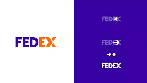
Twitter is buzzing with redesigns by designer Fabian Arbor, and his reimagined FedEx logo might be his best work yet. Through some minor modifications, the E and X now conceal not one, but two covert images.
Fabian Arbor has slightly complicated the original FedEx logo design by capitalizing the 'X' to make it the same height as the 'E', which now creates a negative space that resembles a house, symbolizing the delivery of packages. Despite the added complexity, the hidden arrow remains intact and can still be discovered with careful observation, but Arbor has graciously provided an illustration that highlights the concealed messages.
The updated design is gaining a lot of appreciation on Twitter. One user says, " Love the updated take here! Always felt like the negative space on their current one was almost too downplayed," while another adds, " This version is even smarter than the original, love it!" It's not surprising that the update has received such positive feedback, considering it was created by the same designer behind the impressive Domino's rebrand concept.