
6 Tips for having a Great Portfolio Website!
Ad here
With trends changing at light speed, no one wants to be left behind. With new trends, come new ways of self-promotion and expression, for everyone wants to make their own mark in this huge world of popping talents. So neither should you be left behind in exploring what it takes your portfolio to be noticed and be unique!
Diving into an ocean full of talent across countries and continents is not at all easy. It needs a certain methodology to be followed to remain afloat. The first and the most important step is being easily discoverable across various media and there's no better tool than creating a portfolio website showcasing ones' works to achieve this.
Creating a portfolio or personal website can be quite cumbersome. But following the tips here can definitely make life simpler!
1. User-Friendly Interface
As the saying goes, the first impression is the last impression and so the first look of the website should be able to capture the viewers' attention for them to explore further. This is easily achieved when the screen looks user-friendly, indicating a simple navigation system through the website.
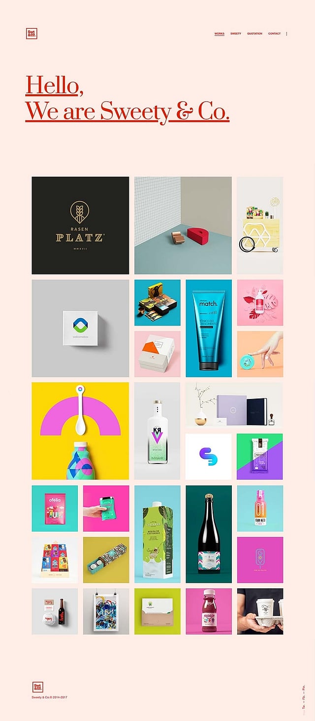
Sweety & Co. is a multidisciplinary team that aims at creating emotional bonds between people, products and brands through design. Their goal is to transform the product into objects of desire through sweetness, vibrancy and joy and this is very easily understandable from the organisation of their website. This indeed transmits signals of easy and direct navigation to what one wants.
2. Simple and Easy Language
Impressing a reader is all about the play of words but sometimes being basic is all it takes to grab the needed attention.
The quality of the written content is an important factor when it comes to promoting oneself. Use of simple words at the right places in a smart manner can make all the difference.
Being simple and easy is not just through word usage, but the content arrangement on the main and sub pages also matters. Optimising the content for a desktop and a mobile is needed at present considering the fact browsing is possible from anywhere and everywhere. This is a perfect example of a website with simple and easy language.
3. Graphical Representation
Browsing through a website is usually followed by the website's graphical content and representation leaving an impact on the reader's mind. In order to have a positive impact on peoples' mind, the designer must pay attention to the graphical data put up.
Adding small and minute details speak for itself and show the readers the interest that one takes in designing even the not-so-important parts of the personal website. This gives the designer an edge over the others as not everyone focusses on these intricacies.
Being monotonous with just visual imagery or long paragraphs of written text is a big no-no as it only drives the readers away. Balancing out between the visual imagery and its written counterpart is a must for a site to have more traffic.
Sometimes what works out is following a theme.
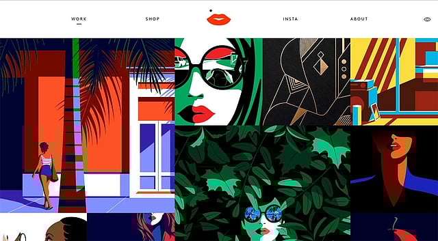
Malika Favre, a London-based French graphic artist has used her profession to her advantage in creating her portfolio website. This has a just right balance of graphics, composition, colours and text to make the reader aware of the skill set of the designer!
Not too less and not too much!
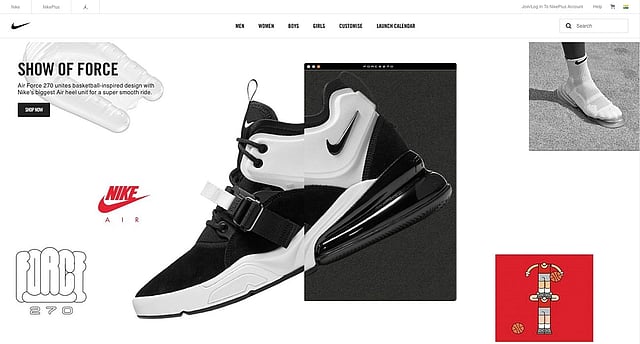
Nike, as we all know is known to come up with the best of the advertising styles. This part of their website, in particular, focuses on 'Show of Force' through words and visuals in equilibrium and is easily comprehended by the reader.
4. Static and Dynamic Elements
As we all know that it's a human tendency to be attracted to moving objects compared to still objects, so sometimes a small animated element does the magic of seeking attention. These animations are referred to as gifs.
Readily available for download and also easy to create in photoshop, gifs surely do make a difference to the overall appearance of a website.
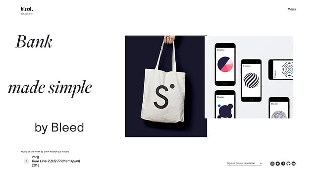
Bleed is an independent design consultancy that helps clients in creating outstanding experiences and identities. Their goal is very visible through their own website design which has a smart mix of moving and still content. The moving content, in particular, keeps the viewer glued to discover what's next.
5. Conveying and Communicating
In today's' times, being successful invariably means standing out from the crowd. This is very easily possible when the designer is able to communicate about who he is, what he does and what he has to offer.
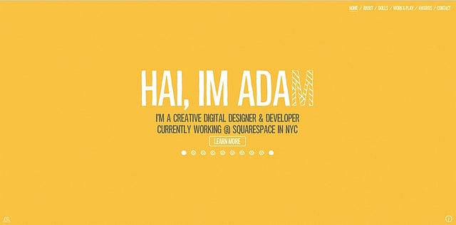
Adam is a creative digital designer and developer specialising in interactive experiences for web, mobile and
tablet devices. His specialisation can be seen and experienced the minute one enters his website. This is a big conveying factor and acts as a guarantor for the client about the quality of work that the designer will deliver. The designer should be aware that the reader is also the business-giver for the designer.
Keeping the above-mentioned pointers in mind while designing a personal website, the designer can strike a balance between the written content and the visualisations in order to convey his point to the reader or the business-giver in an interesting way.
6. The Essence
For any piece of work to be lively, communicative and energetic, it needs to have the spirit of its designer, else it is just a piece of work.
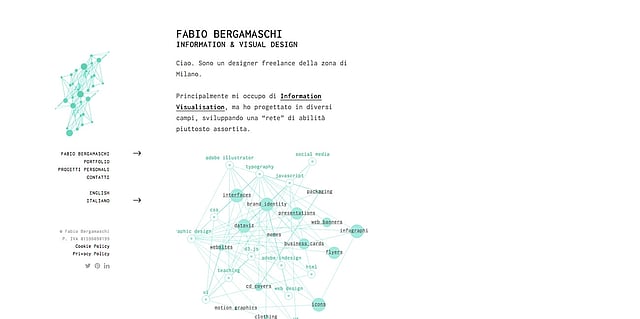
Fabio Bergamaschi is an information and visual designer, who has used the skills of his profession to create his personal website. The use of a single colour to highlight certain points is a smart choice. This showcases a perfect balance of text, visuals and positive and negative space.
More Articles on Web: