News & Updates
Walmart’s Brand Refresh: A Dynamic Evolution Honoring Heritage
Walmart partners with Jones Knowles Ritchie to craft a design that honours tradition while embracing a digital-first future.
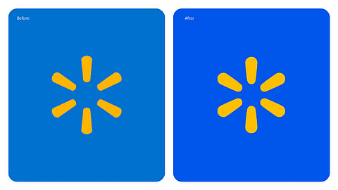

Walmart, the global retail icon, has unveiled its first major brand identity refresh in almost two decades, and it’s a testament to evolution meeting legacy. Partnering with Jones Knowles Ritchie, Walmart’s new look retains its signature spark while embracing modern aesthetics. The spark is now bolder and rounder, exuding energy, while the updated palette introduces "True Blue" paired with a brighter, warmer yellow, giving the design a fresh yet familiar feel.
The refresh also includes a custom sans-serif typeface inspired by Walmart founder Sam Walton’s trucker hat from the 1980s, which featured the Antique Olive font. The new typeface blends heritage with innovation, replacing Myriad Pro and aligning perfectly with Walmart’s digital-first strategy. Separating the wordmark and logo enhances versatility, ensuring strong visual impact across both digital and physical platforms.
As CMO William White states, “Our refreshed brand identity reflects Walmart’s enduring commitment to serving customers while innovating for tomorrow. This is Walmart’s glow-up for the modern age—bold, relatable, and forward-thinking.”
This design evolution positions Walmart as both timeless and transformative, ready to meet the needs of today and the aspirations of tomorrow.