News & Updates
Twitter's New Blue logo is Stirring the World Again!
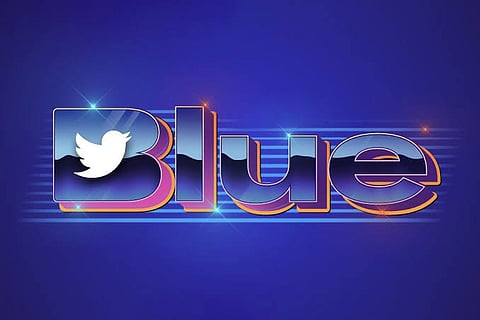
The design team at Twitter HQ might need to take several seats. The new Twitter Blue logo is anything, but cool.

Leave it to Elon Musk to create new headlines and spill the beans for a company that has been predicted dead time and time again. Since Musk's takeover, Twitter has become the new Kardashians of Metaverse.
Another day, another drama. As if the recent critical debacle over verification and subscription relaunch was not enough that Twitter has entered the Metaverse speculation column again for all the wrong reasons!
The new Twitter Blue logo is, supposedly, an 80s throwback, while in reality, it is a gaudy revamp. The design has fundamental finessing issues - from the glossy colour scheme which doesn't even fit Twitter's "Blue" authentic palette to the loosely kerned logo.
A combination of orange and heliotropic purple gradient shade takes away from the representation of Twitter in its true meaning. Call it the cherry on a cake (cake being Rachel Green's English Trifle), the insertion of the "twitter" bird on the letter "B" adds to the absurdity and oblivion of this rejuvenation.
It wouldn't take one to put on their critique glasses to conclude that it imitates a poorly executed last-minute project which lacks both cohesion and elevation of Rebranding concept.
It's no wonder why the Internet is heating as the current management of Twitter seems to be back-pedalling to its nemesis.
What's immensely surprising is that for an individual to metaphorically own the "Metaverse" should also retain the accountability to reflect a positive evolution of a social media platform that holds such an impact on millions.
Nonetheless, ABCs of Typography should be the perfect gift for Twitter's design team. Merely a glimpse of the placement of font is telling of a design with meagre efforts and no backups of proper strategy and feedback.
The flat wide-angled blue-coloured fonts with layers take us to the older version of Microsoft WordArt, which lacks the appeal of the current generation.
Maybe, the popular phrase going around the time since Elon Musk came to the Twitter scene, "Do not fix what isn't broken." is significantly aging well.
At this point, in Elon's downhill chronicles, the recent "Booing" fiasco at Dave Chapelle show seems almost manifested by the resented people.
Still, we can hope that the Twitter enthusiasts with their online comments can bring a positive retaliation of this Blue logo.