The branding for the Paris 2024 Olympics had a rough start, as its "flame" logo was harshly criticized upon its release in 2019 for resembling a woman with a hairstyle known as a "Karen." However, the latest glimpse of the games' branding has raised hopes.
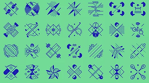
The International Olympic Committee has introduced a new set of 62 pictograms for the Olympic and Paralympic Games, claiming to have "redefined the idea" of the symbols. Unlike traditional symbols, these pictograms do not feature swooshy stick figures, marking a departure from the norm.
In a recent blog post, Paris 2024 has stated that the new designs are elevated from just being visual aids to becoming striking coats of arms that serve as rallying cries for sports enthusiasts. The newly introduced coats of arms not only provide information, but also convey a stronger sense of pride and diversity.
"Having first appeared over half a century ago, Games pictograms are no longer just simple and generalised images for signage, as the whole concept has been reinvented by Paris 2024," the committee explains. "The newly unveiled pictograms illustrate each of the Olympic and Paralympic sports in a unique coat of arms, paying homage to the complexity of each of these sports and what makes them original. Each of the 62 Paris 2024 pictograms is a rallying cry and a symbol; a standard that will ignite fans’ pride during the world’s largest sporting event."
The Paris 2024 pictograms are not just guides but they are now works of art, gracing merchandise like pins and T-shirts as part of the "Make Your Games" collection, available for purchase this month. The pictograms, a departure from the animated pictograms seen at Tokyo 2020, have elicited divided opinions on Reddit, with some users criticizing their busy design as hindering accessibility.
A top comment on the platform reads, " These defeat the point of having pictograms as wayfinding devices, which is absolutely one of their purposes, especially at a global event with people not speaking the language. They are not visually distinct or recognisable enough, especially at a distance. These were designed with TV and branding in mind, with little consideration for accessibility.”
Despite these criticisms, the pictograms are still garnering a better reception than the much-maligned Paris 2024 mascots.