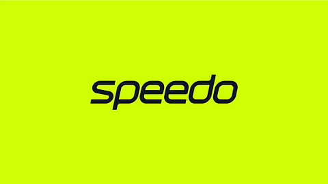
In a bold move to rejuvenate its brand identity, Speedo has unveiled a comprehensive rebranding effort, just in time for the Paris 2024 Olympics. Spearheaded by the creative agency Anomaly London, this rebrand is not merely a cosmetic update but a strategic repositioning that aims to reconnect with a broad and diverse audience, from professional athletes to everyday swimming enthusiasts.
The new identity is centered around the swimmer, with a focus on inclusivity and the love for swim culture. The rebrand seeks to reconnect with a broad audience, from elite athletes to casual swimmers, by emphasizing emotional connection and cultural relevance.
The rebrand introduces a sleek new wordmark and logo, which have been meticulously designed to perform well on swimwear and digital platforms alike. The updated wordmark features shortened ascenders and descenders with streamlined curves, ensuring it looks sharp even when stretched or compressed on fabric. This attention to detail reflects Speedo's heritage of precision and performance, now adapted for a digital-first world.
Speedo has introduced a new brand colour, which is a blend of a specific shade of green that is highly visible underwater and 'medal gold.' This new colour not only stands out visually but also reinforces the brand's deep connection to swimming culture. The rebrand also includes a bespoke typeface inspired by swimming forms, further embedding the essence of swim culture into every aspect of the brand's visual language.