News & Updates
Sandisk Unveils Futuristic New Look
Sandisk’s new logo introduces a pixel-inspired design, combining bold typography with a nod to data innovation.
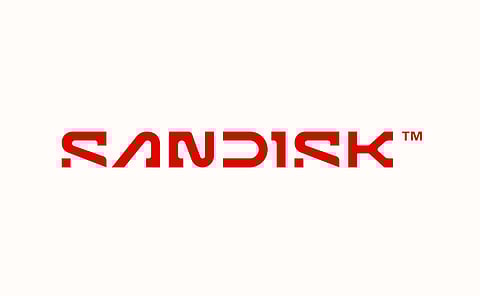

Sandisk has unveiled a reimagined logo as part of a dynamic rebranding effort, preparing for its standalone relaunch in 2025. The updated design takes inspiration from the digital age, emphasising movement, innovation, and data-driven storytelling. While it retains the distinctive open-stem 'D,' other letters undergo transformative changes. The crossbar of the 'A' and sections of the 'S's are removed, giving the logo a sleek, unconventional look. The 'I' resembles a '1' or 'L,' while the 'N' combines curves and angles, echoing a sideways '2.'
The standout feature of this new identity is the pixel-inspired endpoint of the 'S,' symbolising the core idea of data—small, powerful, and transformative. This pixel serves as a versatile element across the brand's digital assets, billboards, and kinetic typography, reinforcing the connection between progress and technology.
Joel Davis, Sandisk’s vice president of creative, shared the philosophy behind the redesign: “The single pixel embodies our belief that progress is not a destination but an ongoing journey. It’s rooted in the way our customers use data to achieve their aspirations.”
This new look also highlights Sandisk’s upcoming separation from Western Digital. The revitalised brand reflects a commitment to the future, using bold visuals and dynamic motion to connect with an audience increasingly reliant on seamless data storage and innovation.