News & Updates

DixonBaxi, a branding and design agency, has teamed up with Warner Bros. Discovery to create a new brand identity for Max, its new streaming service. Max is the combination of two core brands, HBO Max and Discovery+, bringing together entertainment brands such as HBO, Warner Bros., Discovery, DC and Wizarding World, offering a range of stories and characters to the audience.
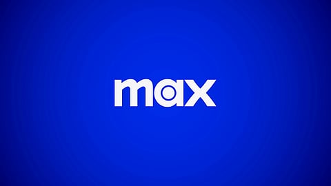
The new identity is designed to capture this variety and appeal to a wider audience, with a bespoke typeface called Max Sans and a logo that nods to its “HBO legacy”. The logo combines the bullseye from HBO and the curves of the Warner Bros. shield, a “modern and timeless” design that is instantly recognisable, according to DixonBaxi design director Karun Agimal.
Max's brand's central graphic device, The Spotlight, evolved from the bullseye in the logo, serves as a unifying asset and appears across all touchpoints, from billboards and social media to trailers and the digital experience. Max's bespoke typeface Max Sans was designed alongside the F37 type foundry. The letterforms feature “geometric forms and elegant curves” similar to the logo and come in a variety of weights, “adapting from genre to genre”.
The primary hue of Max is blue, chosen to signal a change to a broader catalogue and to resonate across genders and age groups. The new identity aims to balance “presence and confidence” with “warmth and approachability” and was designed to be “instantly recognisable” whether on billboards or apps, and to serve as a clear indication of the brand’s purpose and dedication to exceptional storytelling.
Max is set to launch in the US on 23 May, and DixonBaxi has ensured that its new identity will appeal to a wide audience and reflect the brand’s commitment to exceptional storytelling.