News & Updates
Marvel’s Wonder Man Logo Gets a Makeover!
A new minimalist logo for Wonder Man sparks debate among fans and designers, as Marvel trades serif elegance for a bold, industrial look.

Marvel’s upcoming Wonder Man series is back in the spotlight, but this time, it’s not the storyline grabbing attention. It’s the logo.
Recently revealed through a Disney+ promotion, the new Wonder Man logo marks a noticeable shift in design direction. And let’s just say, it’s sparked quite a conversation.
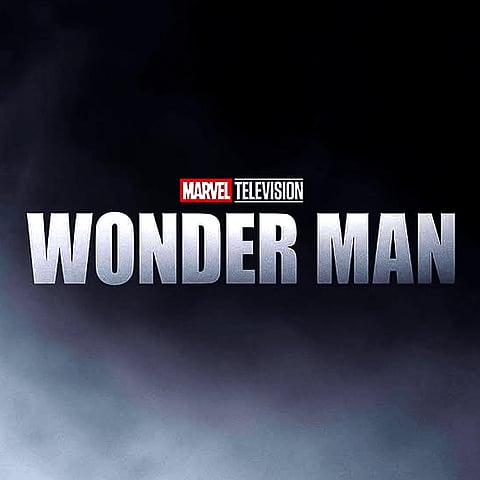
The original logo leaned into a Didone-style serif typeface - elegant, cinematic, and reminiscent of classic Hollywood. It reflected the show’s tone, especially since Wonder Man revolves around an actor navigating fame and identity.
The new version?
A steel-grey palette
Heavy, blocky lettering
And most notably, a shift to the widely recognised Impact font
The result is a look that feels more industrial and stripped-back—prioritising clarity and boldness over nuance.
The internet didn’t take long to respond.
Many fans felt the redesign lost the charm of the original. Comments ranged from calling it “generically boring” to rallying cries like “Justice for serifs!”
Is this a smart move toward clarity and scalability?
Or does it strip away the character that made the original stand out?