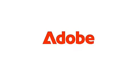
Throughout the years, the Adobe logo has undergone a series of captivating transformations, symbolizing the company's commitment to staying ahead of the curve in the ever-evolving creative landscape.
From the initial design by Marva Warnock and John Warnock in 1982 to the collaborative efforts of countless designers over the years, each iteration of the logo has been carefully crafted to embody the essence of Adobe's creative prowess.
In 2003, Adobe introduced the world to the Creative Suite, revolutionizing the design industry. The logo underwent another striking transformation, renowned designer Neville Brody played a pivotal role in shaping the logo's vibrant and dynamic aesthetic. This colourful depiction perfectly captured the diverse creative possibilities offered by Adobe's software, inspiring designers worldwide to push their creative boundaries.
The year 2013 marked a significant shift for Adobe with the introduction of the Creative Cloud. The logo underwent further refinements under the direction of Michael Gough, the Vice President of Experience Design. The updated logo seamlessly integrated the iconic "A" symbol with the word "Adobe," symbolizing the company's holistic approach to creativity and innovation.
In the midst of Adobe's groundbreaking AI tool announcements, a subtle yet noteworthy change has emerged. While promoting the new text-to-image features of Adobe Firefly, the company has quietly introduced a new version of its logo.
Featured in logo animations within recent videos, the new application presents a bold twist. By reversing the colors of the main Adobe logo and utilizing the graphic mark to replace the letter 'A' in the company name, a fresh Adobe wordmark is born. This revamped design exudes a sense of distinctiveness, while remaining effortlessly legible and recognizable.
To complement the weight of the graphic mark, the new application incorporates a heavier typeface. This results in a more modern and impactful design, making the original Adobe logo appear comparatively frail.
Although the existing corporate emblem, consisting of the white triangle on red followed by the full Adobe name, remains the official logo, Adobe recognizes the visual power of the graphic mark as an 'A.' Consequently, they have embraced the idea of utilizing only the mark or combining it with the shortened 'dobe' for branding purposes.
While the official logo continues to hold its position, the introduction of the new wordmark application renders it somewhat outdated. The change feels so natural that it begs the question of why it wasn't the Adobe logo from the beginning. As Adobe embraces this evolution, their visual identity takes on a fresh and contemporary aesthetic.