News & Updates
Fanta's New Look Brings the Fizz Back to the Brand!
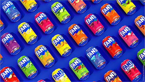
Fanta rebrands with Playful Typography, Fresh Colours, and Bold Logo to appeal to changing consumer preferences.

After PepsiCo’s recent brand overhauls, Coca-Cola joins the stands with their latest rebranding of Fanta. According to Fanta’s Senior Director of Design, Sue Murphy, the new and fizzier experience is aimed to create a bold, iconic identity that will stand the test of time. The brand's new visual identity features a bolder and more recognisable logo, playful typography, and a fresh palette of colours. One of the most significant changes is the removal of the iconic orange colour from the logo, allowing for more flexibility in showcasing different flavours. This brings Fanta in line with Coca-Cola and Sprite, giving it a more cohesive and unified appearance.
Typography also plays a key role in the new visual identity of Fanta. The Fanta Pop typeface, created by Jones Knowles Ritchie, is characterised by its playful and geometric design, with unique features like "letter counters" and "subtle tapering". The typeface is used for primary messaging in the new visual identity, while Fanta Pop Condensed takes on secondary messaging. The Fanta Sans typeface comes in two weights, providing a great contrast to the Fanta Pop typeface while remaining friendly and approachable. The balance between playfulness and flexibility in the typography allows Fanta to communicate its wide range of flavours and marketing messages.
Fanta’s striking new colour palette features a richer and more unique orange and a brighter blue. Each Fanta flavour now has its own colour palette that is flexibly used with "tone-on-tone" hues to add depth and dimension. The use of a Green Leaf detail across the illustrations for each flavour adds a feeling of consistency and freshness.
The freshness of the new colour palette spills over to the new packaging of Fanta as well. Jones Knowles Ritchie reduced the number of elements on the packaging to put more emphasis on the Fanta logo, the flavour illustrations, and the vibrant colours. Overall, the new packaging of Fanta is designed to be eye-catching and playful, staying true to the brand's personality while also adapting to changing consumer preferences and trends.
Fanta's new identity reflects its commitment to fun, and is expected to appeal to consumers of all ages. The rebranding effort puts Fanta in line with other soft drink brands who are updating their brand to cater to a new-age audience. By keeping up with these trends, Fanta is well-positioned to continue to capture the attention of consumers and remain a popular choice in the soft drink market.