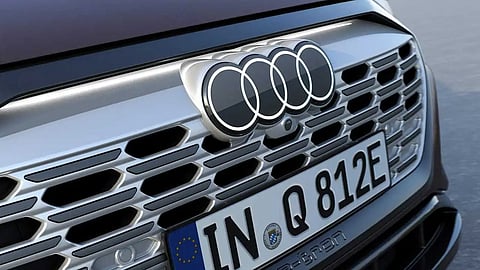
Audi has officially become a part of modern automotive manufacturers who recently exalted their visual identity. These brands have opted for new two-dimensional designs that keep the logos and emblems consistent across mediums, from computer screens to the front grille.
The new Audi logo has already made an appearance on recent Audi vehicles, but the company is only highlighting the redesign on its website describing it as "more purity, more reduction, more consistency."
In terms of the new design, Audi chose a flatter logo that lacks any chrome, instead opting for a high-contrast black-and-white look that adds 3D-like details. It coincides with the automaker also standardising the fonts used inside and out. Its called 'Audi Type', which customers will begin seeing on the B-pillar of new Audi models and likely elsewhere throughout the vehicle.
The designer André Georgi explained: “Today’s chrome rings stand for high quality. The material alone conveys that message. But we believe that we have found the ‘new chrome’. The clarity of the new black-and-white rings makes our corporate identity unmistakable. The thin black border around the rings makes for a consistent, premium-quality appearance, regardless of the car’s paint or radiator-grille colour.”
Audi will still allow customers to get the new rings in black, with the revamped variation replacing the bright white with a dark grey.
... ... ...