Branding

The brand identity of the Afforestation project called Forestscaping created by Pratyush Gupta. Urban forestry is critical to the resilience of cities as they absorb carbon and pollution, aid flood resistance, and enhance human interaction with nature. Afforestt helps convert the tiniest of spaces into self-sustainable native forests which grow ten times faster, are 30 times denser and 100 times more biodiverse compared to conventional plantations. Starting from a mini forest in their backyard, they have grown over 130 forests across five countries around the globe.
Afforestt creates natural, wild and maintenance-free native forests. Forestscaping, a new offering by Afforestt, combines forests with art and architecture to transform barren properties into experiential spaces, where trees, animals and human beings can interact.
Though a unique concept for India, Forestscaping needed to compete with multiple players in the landscape architecture industry, highlighting the advantage of growing forests instead of conventional gardens. It needed a brand identity that captured the strengths and essence of Forestscaping and exuded confidence and expertise.
Forestscaping was targeted towards an affluent audience and required a positioning strategy that was distinct from Afforestt. The challenge was to cultivate a new personality for Forestscaping while holding Afforestt core values and beliefs.
It was challenging to capture the energy and joy of being one with the forest, at the same time, maintaining a level of sophistication and elegance to appeal to the audience.
Forestscaping just starting and didn't have any photographs to showcase, hence we needed to create an identity which compensated for the lack of visuals and blend seamlessly with images once they were available.
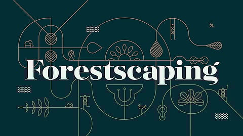
At the heart of the Forestscaping visual identity is a confident and elegant logotype. The G in the logotype has a leaf sprouting from its end, a subtle reference to forests and their beginning. The primary colours of the identity are green-representing forests, and gold - symbolising the wealth that forest create.
A dynamic illustration language amalgamates forests, animals and people to create various forestscapes that bring to life diverse touchpoints. The illustration style has been inspired by Varli and Sohrai art forms, providing the visuals with an earthy aesthetic rooted in Indian culture.
"I see Pratyush work as an outcome of extreme creativity that produces some of the simplest yet brilliant art. His clear understanding of people perception makes him a business problem solver. He is a deep listener and can see the world through the eyes of his clients. Working with him created a synergy that improved our work and elevated our perception towards it"