Typography
Feel Between The Letters!
Crafting Captivating Typefaces: The Creative Journey of Rajesh Rajput.

Balancing boldness and identity, Rajesh Rajput’s typefaces demand attention and evoke emotions. His creative journey empowers him to make a difference, inspiring the world with captivating designs.
Can you tell us a little bit about yourself, your early life, education, work experiences and how did you get into the creative world?
I was born and brought up in Delhi, spending a significant part of my life in Delhi Cantonment due to my father’s military service. There, I completed my schooling and pursued my graduation in commerce. My career journey began early as an Account Assistant, leveraging my commerce degree. One day, a friend introduced me to the world of graphic design by suggesting that I should take up a course in the field. Despite being unaware of graphic design initially, my friend believed my talent for scribbling people’s names on their notebooks would make me a good fit for the creative industry. Intrigued, I decided to enroll in the course.
Long story short, I enrolled in the course, changed several jobs in different agencies, and eventually landed a decent job.
Can you walk us through your creative process when developing a new typeface? How do you incorporate the visual elements of the accompanying illustrations into the letterforms?
My creative process follows a conventional yet effective approach. Initially, I let my imagination run free, sketching whatever comes to mind. Afterwards, I delve into research to seek inspiration that complements my vision. The actual typeface design takes shape in a dedicated typedesign tool.
Once the design is complete, I shift my focus to other critical elements, such as spacing and kerning, ensuring the typeface achieves a harmonious balance. The testing phase comes next, which surprisingly consumes more time than the actual design stage. I take pride in crafting versatile typefaces that can be applied to various subjects.
During my presentations, I make a concerted effort to provide references and insights to the audience. Sharing my work is an incredibly satisfying experience for me, and I eagerly look forward to each opportunity to unveil a new typeface.
How do you strike a balance between the expressive qualities of your typefaces and their legibility? What considerations do you consider to ensure that the typefaces maintain their functionality?
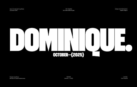
The majority of my typefaces are Display typefaces. Their primary purpose is to grab attention and effectively convey the intended message. However, it is important to strike a balance. It’s not just about the aesthetic beauty of the characters; I also strive to ensure that each character retains its unique identity. I pay close attention to the curves and negative space of the characters, making sure that they do not compromise the overall identity. Since Display typefaces are typically used in larger sizes, you can be a bit more adventurous with them.
What challenges, if any, have you encountered while working with typography in your designs? How do you overcome these challenges and maintain the visual cohesion of your artwork?
Designing a unique typeface comes with the challenge of ensuring consistent glyphs, providing multi-language support, and designing other features. This is a challenging part of the type design process. However, it becomes easier over time as you become more familiar with the process. As I mentioned earlier, I look forward to creating presentations for my typefaces. While I strive for consistency in my type design, I intentionally aim for variety and creativity in my presentations. I want each presentation to be as diverse as possible.
Typography is often associated with conveying information or storytelling. How do you utilise typography as a storytelling element? Are there any storytelling techniques or narrative structures that you find particularly effective?
You need to choose the right typeface for your projects. For instance, in fashion projects, designers often choose Serif typefaces, which have high contrast and fit well with the subject. Serifs are vibrant, creating visual tension and grabbing people’s attention. On the other hand, in finance subjects, sans-serif fonts are quite popular. In that scenario, information is more important than style; the goal is to help people understand the content rather than merely appreciate the beauty. Ultimately, it all comes down to communication – how you want to convey the message and in what style.
Technology has opened up new possibilities for typography design in recent years. How do you utilise digital tools and software to enhance your creative process and bring your work to life?
Technology has opened up new possibilities for type design and typography. I used to spend days creating a the simplest of designs, but now the same can be achieved in minutes.
Additionally, I believe variable fonts are quite interesting in typography. As a typographer, you have the liberty to choose your style or weight, making it a significant tool for typographers. Software and tools can not enhance creativity; they are merely there to help you become more time-efficient. Software can't be part of your creative process; they are there to complete your process but not to contribute to the creative aspect.
What inspires you?
I can’t sit idle; I just love creating something or the other. It could be typography, a poster, or just a mock-up. From the beginning, I have enjoyed the process of creating something, dedicating hours, weeks, months – and sometimes even years – to a project. Sharing that with the creative world gives me a different kind of satisfaction. Lately, I have been receiving messages from people all over the world, and I truly appreciate them for sharing how they feel and how they use my work. I am just glad that I could make a difference in someone’s life through my creations. However, there are times when I just want to chill, enjoy a good series, go out, have fun, and spend time with family. So, I would say strive for balance in your life. But the creative process primarily is the only thing that inspires me to keep creating.
Your typography-based illustrations often evoke a sense of playfulness and vibrancy. What emotions or reactions do you hope to evoke in viewers through your artwork, and how do you achieve this through your use of typography and colour?
As I have said earlier, my typefaces demand attention. They are bold, with the majority of them being condensed and possessing a distinctive style. I believe that a typeface doesn’t inherently have emotions; rather, it conveys a style, while emotions come through the content it presents. I could be completely wrong, but this is something I firmly believe. That’s why, in my type of presentations, I showcase different subjects or emotions. Essentially, you can use the type style to communicate various emotions through your content.
How do you envision the future of typeface design from a visual design perspective, especially about the growing prominence of colourful 2D illustrations? Are there any new trends or innovations that you find particularly exciting or inspiring in this field?
I may not be the right person to talk about the future of typeface design since there are so many aspects to consider when discussing typography. However, one trend that I have observed is the growing popularity of condensed typefaces, and this is largely due to the physical appearance of the devices we use. The majority of devices have narrow widths, making condensed typefaces a perfect fit for them. Additionally, I believe that the increasing availability of better screens and higher resolutions has made people more receptive towards display typefaces.