Typography
A Modern Brand Rooted in Tamil Culture!
A premium paint brand, Neotė by Indicus Paints, designed by Plus One Design, with typography by Gautam Patil, brings Tamil culture into a contemporary visual language.

Walk into a paint store today, and most premium brands start to look the same.
Clean layouts, safe colours, and a “global” feel that could belong anywhere.
Neotė takes a different route.
Created for the Tamil Nadu market, the brand doesn’t try to neutralise its identity. Instead, it builds from something very specific, language and culture.
The typography plays a key role here.
Developed by Gautam Patil, the wordmark blends Latin and Tamil scripts. It reads in English, but carries the structure and movement of Tamil letterforms. The result feels familiar, but not generic.
It’s a small shift, but it changes how the brand is perceived.
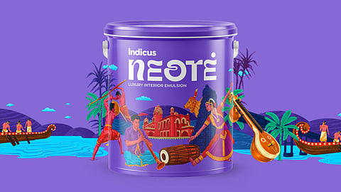
This thinking continues into the packaging.
A deep purple base sets a calm, premium tone. It avoids the usual brightness associated with paint brands and instead leans into something more controlled and confident.
Layered onto this are illustrations inspired by Bharatanatyam, Kolam, and other classical forms. These elements bring cultural context into the system without making it feel heavy or ornamental.
They add character, but still leave space for the product to stand out.