Graphic Design
Designer Aastha's Fusion of Cultures Wins Top Prize at Pune Design Festival
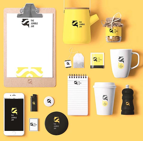
A student at MAAER’S MIT Institute of Design, Pune, Aastha Bhattacharya, one day aspires to be a visual communication designer. With a vision to express herself through socially relevant projects and ability to handle a project right from the beginning ideas to the final execution, it is clear why she has won the first place in the Battle of Design Projects at the 10th Pune Design Festival, 2016. Her self-initiated project ‘The Jumble Jar’ allowed her to be both the boss (i.e. client) and the artist (i.e. designer).