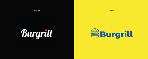
The Neat Trick shares their journey of creating the new brand identity system of Burgrill, a burger brand with a healthy twist. Gear up for a behind-the-scenes look into how Neat Trick’s strategic and creative aces brought forth a brighter, bolder yet minimal identity.
Client – Burgrill
Requirements – Rebranding, Packaging and Illustrations
The Better, Butter Burger Brand!
The literal amalgamation of the word “Burger’” and “Grill”, Burgrill is a brand that solely took upon itself to change the world of cravings, for better, butter and burger! They are out to revolutionize burgers for people with good and conscious taste. They took the good old burgers and tweaked how and what is put inside to match the cosmopolitan-health-conscious clientele. A healthier route for a fast food that is universally loved and an idea this novel needed an identity that could stand up to it and match their vision.
The rebrand should
1. Highlight the key factors of Burgrill being a healthier option for the iconic burger.
2. Stand out in an over saturated market.
3. Reflect trust and credibility
Road Less Taken to Stand Out
Rebranding is not an easy task, there is always an attachment to the previous design and style, it is what the brand is known for. Burgrill's prior logo featured the traditional colour scheme for food brands—black and orange—with fire as its distinguishing feature.
The first difficulty was persuading the client to abandon a strategy that has been produced repeatedly throughout the years by several brands. The rugged graphics though representative of a grill no longer served the purpose. The need of the hour was a simpler display & vivid colours for immediate attention.
The Win Win Burger
“Grilling burgers is better”. With a fast food so iconic in the way it’s made, how do you put that message out? Instead of calling it a healthy burger, they decided to call it the “win-win” burger. Impactful yet not in the face. A simple message, that reflects trust and credibility. Burgrill is made to be bold, fun, and a brand that brings a lot of personality in an over-saturated market. Strategic without trying hard.
What You See is What You Eat
Keeping in line with their defining healthier burger route, the approach towards design followed a simple concept, “What you see is what you eat. They wanted to de-route from the mainstream approach of using the old school colours in the F&B industry while also paying homage to the appetising approach of burgers but with a new take on colours. Hence, the conception of the colour palette directly from the food palette itself. They have brought cheese, lettuce, tomato and the components of a grilling frame to life!
Bright, Bold and Minimal
Through the redesign, they aimed to make the company as distinctive as its burgers. In today's virtual world of things, consumers are drawn to visuals. A combination of flat designs and 3D elements complemented their colour scheme and the philosophy behind creating Burgrill. They have used the Montserrat typeface to draw on the rich history of craftsmanship and local knowledge to combine and preserve in a new, open-source free typeface for use in the most modern environments. Montserrat Alternates gives a fun, smooth, and fresh vibe to the identity.
In the post pandemic world, the majority of Burgrill’s customer base would experience the brand digitally, and they wanted all aspects to marry together to create an identity that was bright, bold and minimal.