Case Study
Call Me Chunky: A Showstopper Branding
In a category built around indulgence, Call Me Chunky takes things a step further - it turns indulgence into spectacle.

Built around loaded textures, oversized inclusions, and a personality that refuses to blend in, the brand embraces everything its product is: chunky, playful, and unapologetically extra. More than an ice cream brand, Call Me Chunky is designed as a performance - one where every flavour, visual, and interaction demands attention.
The Indian ice cream market is booming, but visually it remains remarkably predictable. Soft pastels, familiar flavour cues, and nostalgia-led storytelling dominate the aisle, creating a sea of sameness where differentiation is often subtle and easily missed.
Most brands sell comfort. Most brands look comfortable.
For Call Me Chunky, the challenge was clear: create a brand that could cut through visual repetition and establish an instantly recognisable presence in a crowded category.
At the heart of the brand was a simple but powerful truth: this wasn't smooth, minimal, or refined ice cream - it was loaded, chunky, and unapologetically indulgent.
Instead of downplaying this, the design amplified it.
The idea of "Magically Chunky" emerged as a creative springboard, where chunkiness anchored the product truth, and magic unlocked expressive freedom. This duality allowed the brand to move beyond traditional food design and enter the realm of performance.
It wasn't just about showing the product.
It was about staging it.
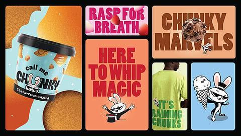
The most defining design move was elevating chunks from ingredient to visual property.
Instead of being tucked inside the scoop, chunks were:
Exploded outward
Magnified in scale
Made tactile and dramatic
Textures became loud, visible, and almost exaggerated—inviting consumers to feel the indulgence before tasting it.
Typography followed suit.
Gone were the soft, cursive, dessert-like fonts. In their place came bold, blocky, flavour-packed letterforms that visually echoed the density and richness of the product.
This wasn't delicate design, it was design with bite.
The visual assets weren't designed to sit passively on a pack, they were designed to perform.
Chunkiness became a tool for creating active dialogue across touchpoints. Chunks burst beyond boundaries, flavours revealed themselves like tricks, and every asset worked together to create moments of surprise and interaction.
The brand world naturally extended into experiences: theatrical retail displays, oversized chunk installations, magical flavour reveals, and playful pop-up environments that invited consumers into the performance.
Here, chunkiness wasn't simply a product characteristic.
It became behaviour.
A visual language that interrupted, engaged, and demanded attention wherever it appeared.
To bring this world alive, the brand introduced a sassy magician bunny, a familiar symbol reimagined with attitude.
Traditionally associated with magic, the rabbit became a narrative device:
Each trick revealed a new flavour or texture
Each appearance added drama and personality
Each interaction turned the brand into a performance
The mascot wasn't decorative, it was central to the storytelling system. It bridged product, personality, and communication, making the brand feel alive across touchpoints.
What sets Call Me Chunky apart is how consistently its visual language translates across mediums.
On shelf, it disrupts:
Loud colours break through pastel monotony
Chunky visuals command attention instantly
Bold typography ensures quick recall
In retail and pop-up environments, it immerses:
Oversized chunks become spatial elements
Magical reveals create moments of discovery
Interactive installations extend the brand story beyond the pack
On digital, it performs:
Visuals become dynamic, almost animated in feel
The mascot drives storytelling and engagement
Content leans into drama, humour, and spectacle
This seamless extension ensures the brand doesn't just sit in the freezer, it shows up wherever the consumer is.
Instead of positioning ice cream as a passive treat, Call Me Chunky reframes it as an active sensory experience.
Scoops become stage acts
Flavours become plot twists
Textures become moments of surprise
This shift transforms the brand from a product-led offering to an experience-led one, where indulgence is not just tasted but performed.