Read Through the Award-Winning Nirlep Identity Re-Creation!

Step 01
The brief was simple. Nirlep has been actively developing products for the modern lifestyle of young couples who look for convenience and style at affordable prices. The objective was to update the brand identity to reflect this new dynamism. Through a series of workshops and interactions with the leadership team at Nirlep, an idea web was articulated to outline what the brand stood for. The sessions helped in understanding and revealing the company's strengths, product attributes, user requirements and their aspirations.
Step 02
The design process began with numerous quick pencil sketches to bring ideas to life. These were then discussed internally and whetted based on contemporary appeal, differentiation against competition, building product attributes and highlighting company legacy.

Step 03
The shortlisted ideas were then taken forward to the next stage which involved creating digital sketches in black and white to gauge visual balance and relation with typeface. Some ideas developed further into newer interpretations while some were visually enhanced.

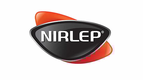
Step 04
The concept that emerged as a winner was the one inspired by a pan-shaped form which also symbolized a leadership badge. Various explorations were tried out at this stage within the selected option. The colour red was retained to portray warmth and passion with which Nirlep products are conceived and created. The old American typewriter font was discarded for a custom designed set of letters, but the 'all caps' treatment was retained to reiterate the brand's
leadership, confidence and trust.

Step 05
The new logo was compared to the old one. It is flexible and playful, just like their products. It signals the transformation of Nirlep from a userfriendly cookware brand to a comprehensive Kitchen solutions brand with global standards. The specially developed Logotype, Nulep, enhances the modern character of the identity. And the black badge, red wing, silver rim and logotype, come together to portray leadership, dynamism, sensitivity and stability of the company; everything the brief demanded.

Step 06
Over the years, Nirlep has created several product brands that have become popular with diverse audience types. It was important that the new brand identity facilitated customization and flexibility for sub-brand extensions while retaining the presence of a strong mother brand.
The colorful renditions of the identity stand for innovation to delight young progressive consumers and connect with the sub-brand propositions - Aspa for partnering progress, Selec+ for lifestyle improvements and Acilis for eco-friendly materials and finishes.
Step 07
Finally, logo variants were created for various printing and size limitations. These included simple gradient, flat colour, black & white and reverse versions.

Step 08
An Arabic version of the identity was also created for their export business. The typeface was custom made to match its English version.

Step 09
The new Nirlep identity was showcased through the brand book that detailed the brands journey to fit the lifestyle of young Indian couples.

Step 10
The new brand identity was made widely visible by launching through various media both outdoor and in-shop.

Step 11
The old Nirlep logo was replaced by the new one on every product, completing the journey from paper to metal.